Time Out
Classic magazine defining a generation...

The Challenge
TimeOut is an iconic listings magazine launched in 1968 by Tony Elliott and Bob Harris (who went on to host BBC’s Old Grey Whistle Test). It’s easy to say that pretty much anyone who grew up, lived in or has visited London since then will have seen or know the TimeOut brand.
One of the most iconic aspects of TimeOut is the logo – the neon sign is still evident in Tottenham Court Road, London where the group is headquartered. Another is the use of good design and editorial for its covers. Leading designers and photographers like Pearce Marchbank and Rankin have designed and photographed for it. It has also featured everyone of note: Actors, Musicians, Authors, Artists. In short, it is part of the culture.
Creating designs which crossed over forty years of brand evolution, covers design and typography was never going to be easy. During the development phase 50% of the group was sold to Peter Dubens and Oakley Capital. See the results of the work below.
About TimeOut: For more about TimeOut look here.
Project Overview & Solutions
The solution often turns out more beautiful than the puzzle – Richard Dawkins


Project Overview
There were three main design approaches identified in the TimeOut project. Each presented different opportunities and challenges:
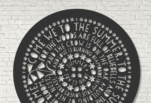
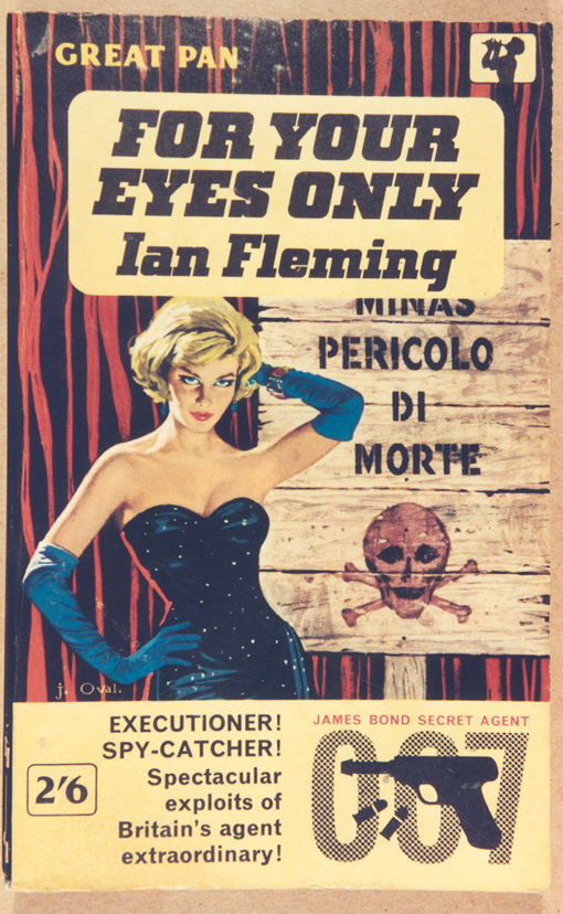
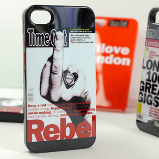
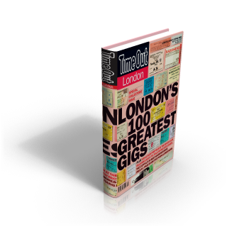
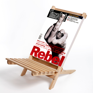
- Cover Archive – This is the richest source of designs which crosses five decades and defines the look and feel of all of those periods. It also presented a problem in rights as some photographers, illustrators and designers weren’t known. Others couldn’t be contacted or the boundaries between in-house and commissioned were blurred. So, although over 2000 covers were potentially useable the actual reservoir of designs was much smaller initially.
- TimeOut Brand and Logo – This is city based and global and covers not just London but most major cities on all continents. This had colour themes and structured implementation which allowed for a variety of different approaches.
- Potential new Typographical design IP – TimeOut group house-style was largely based on the logo, Franklin Gothic and Dutch801 for headlines andemphasis, and Century for body copy. The Franklin Gothic had been used to good effect stylistically in books and there was potential for new IP in combination with the TimeOut Logo.
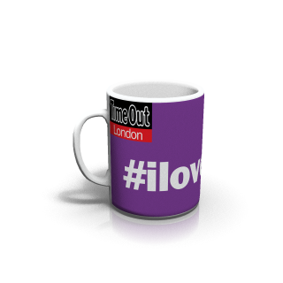
- Social Media and hashtags. TimeOut ‘owns’ use of the the #ilovelondon tag. It was felt this could be implemented with flair.
Design approaches were personally approved by Tony Elliott (who has always overseen the brand and its evolution) and his team including Cathy Runciman (MD of TimeOut International).
The main designs created (not all were put into mass-production) were:
- TimeOut Notebooks – Two styles: Typo (Logo&Hashtag), Cover-based
- TimeOut Cushions – Cover-based
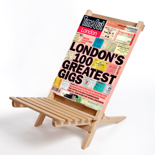
- TimeOut BeachChairs – Cover and Typo (Logo&Hashtag)
- TimeOut Mugs – Typo (Logo&Hashtag)
In addition a number of designs were proposed as part of the evolution of the project with potential including:
- TimeOut Messenger Bag – Cover & Typo (Logo&Hashtag)
- TimeOut Laptop Cases – Cover & Typo (Logo&Hashtag)
Design Innovation
The richness of the cover sources naturally lent itself to matching cover design with object. e.g. passport issue for passport cover. Others were used purely for design aesthetic.
Website: TimeOut Shop
Distribution: UK/Europe/ROW
Availability: the designs were limited editions and are available directly from TimeOut. Originally sold in London by Liberty, London and available online.


Other Projects
All life is an experiment. The more experiments you make the better - Ralph Waldo Emerson